レイアウトを組むのに便利な『flexbox』。
今回は『flexbox』と『margin: auto;』を使用していい感じにレイアウトを組んでみましょう。
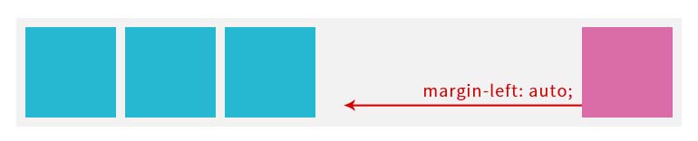
左に3つの要素、右に1つの要素を置きたい
 このレイアウトだと左側の3つをさらにdivなどで囲み『justify-content: space-between;』を一緒に指定する方法などが考えられます。
ただその分余計な囲みが増えてしまう、ということでもあります。
そのため一番最後の要素(右側)の要素に対して『margin-left: auto;』を指定するとここだけ一番右側に寄ってくれます。
HTML
|
1 2 3 4 5 6 |
<div class="itemWrap"> <div class="box"></div> <div class="box"></div> <div class="box"></div> <div class="box"></div> </div> |
CSS
|
1 2 3 4 5 6 7 8 9 10 11 12 13 14 15 16 17 |
.itemWrap { display: flex; padding: 10px; background: #f2f2f2; } .itemWrap .box { width: 100px; height: 100px; background: #26B8D0; } .itemWrap .box + .box { margin: 0 0 0 10px; } .itemWrap .box:last-of-type { background: #DB6CAA; margin-left: auto; } |
どうしてこんな動作を…?というとものすごく簡単にいうと余分なスペースを占有するように『margin: auto;』が自動的に調整してくれるみたいです。
左に1つの要素、右に3つの要素を置きたい
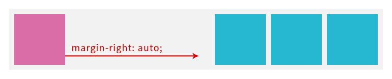 こちらの場合、今度は『margin-right: auto;』を指定します。
HTML
|
1 2 3 4 5 6 |
<div class="itemWrap"> <div class="box"></div> <div class="box"></div> <div class="box"></div> <div class="box"></div> </div> |
CSS
|
1 2 3 4 5 6 7 8 9 10 11 12 13 14 15 16 17 |
.itemWrap { display: flex; padding: 10px; background: #f2f2f2; } .itemWrap .box { width: 100px; height: 100px; background: #26B8D0; } .itemWrap .box + .box { margin: 0 0 0 10px; } .itemWrap .itemWrap .box:first-of-type { background: #DB6CAA; margin-right: auto; } |
左右と中央、それぞれに要素を置きたい
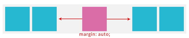 左右に要素を置いて、中央に一つ要素を置くというレイアウトも中央の要素に『margin: auto;』を指定することで実現できます。
HTML
|
1 2 3 4 5 6 7 |
<div class="itemWrap"> <div class="box"></div> <div class="box"></div> <div class="box"></div> <div class="box"></div> <div class="box"></div> </div> |
CSS
|
1 2 3 4 5 6 7 8 9 10 11 12 13 14 15 16 17 18 19 20 |
.itemWrap { display: flex; padding: 10px; background: #f2f2f2; } .itemWrap .box { width: 100px; height: 100px; background: #26B8D0; } .itemWrap .box + .box { margin: 0 0 0 10px; } .itemWrap .box:nth-of-type(3) { background: #DB6CAA; margin: auto; } .itemWrap .box:nth-of-type(4) { margin: 0; } |
中央に『margin: auto;』を指定することでこのような一見特殊そうなレイアウトもできました。
ちなみに中央要素の右側の要素のmarginは余計な隙間ができるので0を指定してください。
flexboxとmargin: auto;を使えば、少ないコードでいろいろなレイアウトが実現できます。
ぜひ使ってみてください。

